[box color=rgba(25,118,210,.05) right]
Help wanted!
One of my readers asked for a year picker, but I'm short of time. Dear community, can you chime in? Send me the code as a comment or via email, and I'll update this article or even write a new one, of course mentioning and praising you![/box]
Angular Material has a very short description of converting a standard date picker into a month picker. Let's fill in the missing bit and pieces. If you're in a hurry, have a glimpse at the working source code on GitHub.
The idea
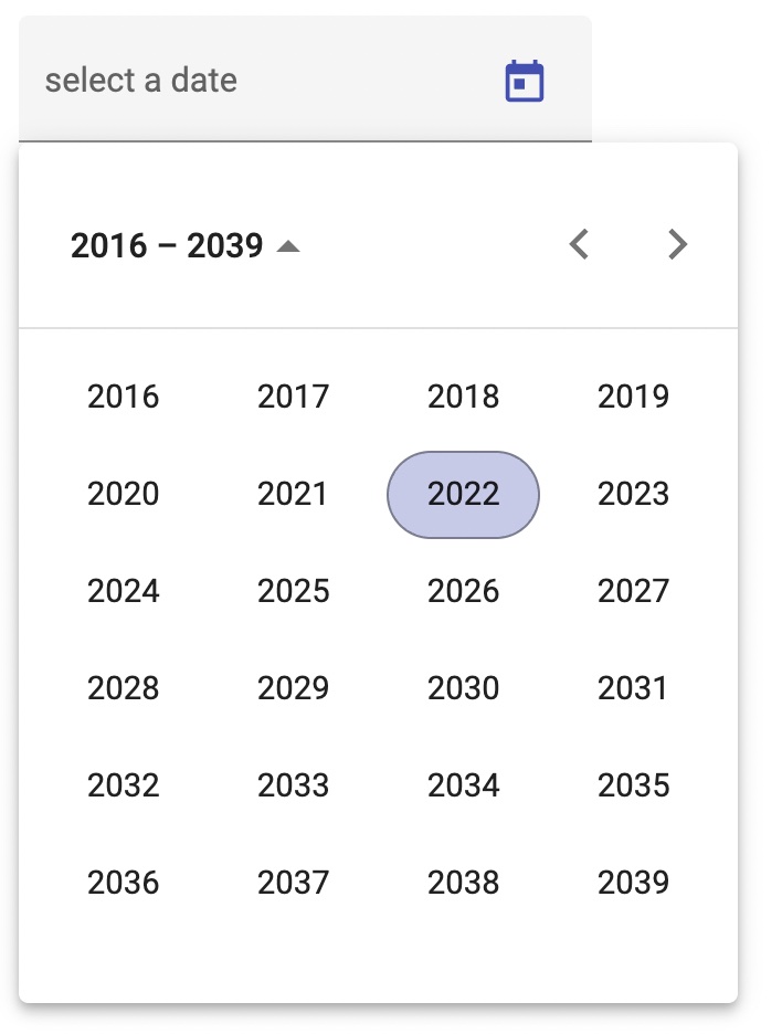
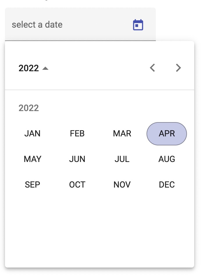
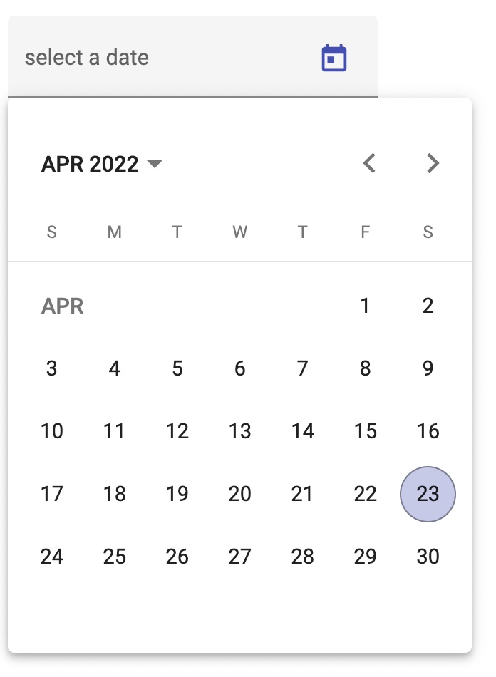
The calendar widget of the Angular Material date picker has three starting views. There's the traditional calendar, but you can also use a wizard mode. It begins by selecting a year. Once that's done, you can select the month, and finally, you choose the day within that month.
We're going to use the middle view, which starts with selecting the month and allows you to choose the year and configure the date picker so that it never jumps to the third view. We also modify how the date is displayed and how users can input it using the keyboard.
Before we do that, let's look at a different issue.
Step 1: get rid of moment.js
The official Angular Material documentation on monthpickers uses moment.js. The vast majority of StackOverflow articles and blogs seem to do the same. There's just a tiny problem: moment.js was a great project in its day, but it has officially been abandoned in September 2020. At the time of writing, that was one and a half years ago. It makes me wonder whether Angular Material is a well-maintained project. The good news is you don't have to use moment.js. It was just a bit painful to figure it out without documentation.
So make sure to import the native version of the date module im your AppModule:
[sourcecode typescript]
import { MatNativeDateModule } from '@angular/material/core';
import { MatDatepickerModule } from '@angular/material/datepicker';
import { MatInputModule } from '@angular/material/input';
@NgModule({
declarations: [...],
imports: [
MatInputModule,
MatDatepickerModule,
MatNativeDateModule, // this is the version without moment.js
],
...
[/sourcecode]
Step 2: replacing the calendar with the month view
The HTML template code of our monthpicker is almost identical to the standard date picker, with a few modifications:
The attribute [startView] of the <mat-datepicker> is set to 'year'.
We listen to the event (monthSelected). When it fires, we close the datepicker, thus preventing the datepicker to show the day selection.
Optionally, we also add a <mat-hint> so people know the format of the date when they enter it using the keyboard.
In other words, our HTML template looks like so:
[sourcecode html]
monthpickerMM/YYYY
[/sourcecode]
The magic is hidden in the method monthChanged(). It calls picker.close() to hide the calendar view of the date picker. You'll see the implementation in a minute.
Step 3: modify the formatting of the input field
The last step requires us to create a dedicated component for the month picker. We want to replace the standard formatting - like 04/23/2022 - with a custom formatting. There's no point in displaying the day, so we want to show the date as 04/2022. The custom formatter is defined via dependency injection, but we don't want to modify every date picker of the entire application.
So we create a component with providers:
[sourcecode typescript]
@Component({
selector: 'app-monthpicker',
templateUrl: './monthpicker.component.html',
styleUrls: ['./monthpicker.component.css'],
providers: [
{
provide: DateAdapter,
useClass: MonthpickerDateAdapter,
deps: [MAT_DATE_LOCALE, Platform],
},
],
})
export class MonthpickerComponent {
@Input()
public monthAndYear: Date | null = null;
@Output()
public monthAndYearChange = new EventEmitter();
public emitDateChange(event: MatDatepickerInputEvent): void {
this.monthAndYearChange.emit(event.value);
}
public monthChanged(value: any, widget: any): void {
this.monthAndYear = value;
widget.close();
}
}
[/sourcecode]
This implementation uses [(ngModel)]. If you prefer reactive forms, you'll want to modify
the implementation.
What's missing is the MonthpickerDateAdapter. Most recipes I've found in the internet use format pattern strings, but I didn't manage to get this approach up and running. Probably it works only with moment.js. Luckily, implementing the data adapter isn't much work:
[sourcecode typescript]
export class MonthpickerDateAdapter extends NativeDateAdapter {
constructor(matDateLocale: string, platform: Platform) {
super(matDateLocale, platform);
}
override parse(value: string): Date | null {
const monthAndYearRegex = /(10|11|12|0\d|\d)\/[\d]{4}/;
if (value?.match(monthAndYearRegex)) {
const parts = value.split('/');
const month = Number(parts[0]);
const year = Number(parts[1]);
if (month > 0 && month <= 12) {
return new Date(year, month - 1);
}
}
return null;
}
override format(date: Date, displayFormat: any): string {
const month = date.getMonth() + 1;
const monthAsString = ('0' + month).slice(-2);
const year = date.getFullYear();
return monthAsString + '/' + year;
}
}
[/sourcecode]
Wrapping it up
That's all! It took us roughly 50 lines of code to implement a month picker that can co-exist with standard date pickers on the same page.
 We're going to use the middle view, which starts with selecting the month and allows you to choose the year and configure the date picker so that it never jumps to the third view. We also modify how the date is displayed and how users can input it using the keyboard.
Before we do that, let's look at a different issue.
We're going to use the middle view, which starts with selecting the month and allows you to choose the year and configure the date picker so that it never jumps to the third view. We also modify how the date is displayed and how users can input it using the keyboard.
Before we do that, let's look at a different issue.